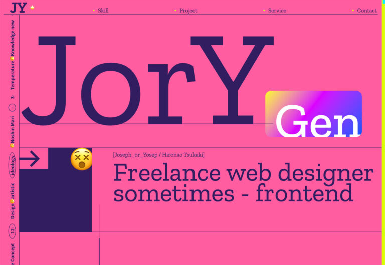
2 days ago
Welcome to our pick of sites for March. This month’s collection tends towards the simple and clean, which goes to show that minimalism never truly goes out of style. Whether it’s about getting a lot of information across, or using space to create a sense of luxury, keeping things appear simple is an approach that solves many design challenges. Enjoy!

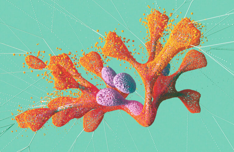
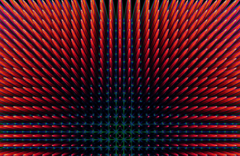
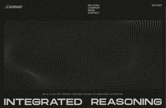
Integrated Reasoning makes processors that solve optimization issues, which is not the easiest thing to promote in a glossy website. The solution here is to play with geometric line art and put a noise effect over everything both of which add a charming retro aesthetic to the design.
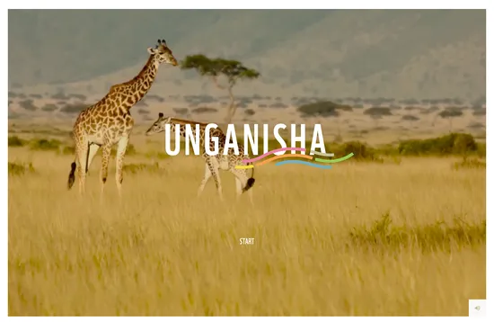
This site for the WWF’s Unganisha project in East Africa provides a wealth of information through an appealing, interactive interface. Simple, colorful graphics and icons combine with beautiful photography to create a pleasing immersive experience.
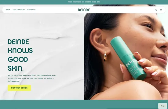
Deinde is a new biotech based skincare brand. The website’s color scheme has a fresh but calming feel while also implying a nature-friendly ethos, and the images create a sense of warmth and approachability.
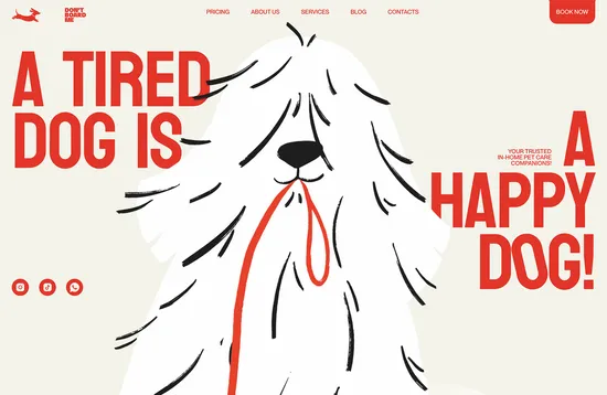
There is a fun, friendly feel to this website for dog walkers and sitters Don’t Board Me. Illustration plays a central role here, along with large, colored type and matching tinted backgrounds.
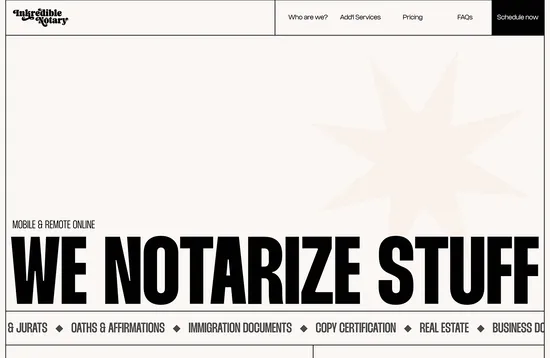
This is a slightly surprising site in that it takes something that most of us might find a little grey and bureaucratic, and gives it a bit of zing. The magazine style layout adds character without sacrificing the clear presentation of information.
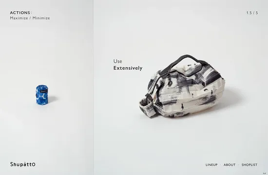
Shupatto bags are pleated to fold away easily, and the website plays on this idea throughout: sections ‘unfold’ across the screen, and images expand to fill the screen. Stop motion animation is used extensively as a charming alternative to static product shots.
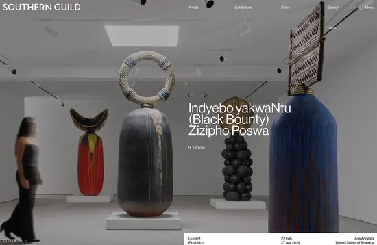
With locations in Cape Town and Los Angeles, Southern Guild represents contemporary artists from Africa and the African diaspora. Photographs of the artists and their works dominate, with a careful balance maintained between the two gallery sites.
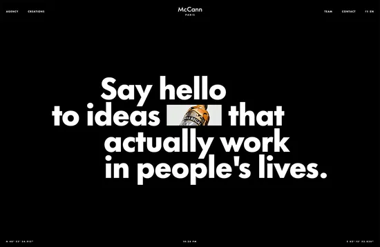
McCann WorldGroup is one of the largest ad agencies in the world with offices in over 100 countries; this site focuses on the work of their Paris office. It succeeds at being a standalone presentation, while still feeling intone with the larger group.
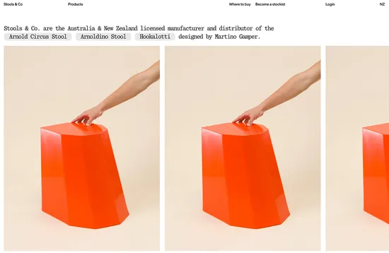
This is a really simple, basic but not brutal, site promoting 3 products. Having the product images rotate — on scroll on mobile and on mouseover on desktop — is a nice detail.
Navigation is strong here, with a pleasing card effect as projects scroll up the screen. It’s a large-ish site with a lot of content, but it all feels within easy reach and connected.
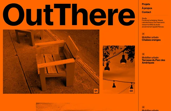
OutThere’s orange chair is the flagship piece from their urban furniture design studio, and the website’s main color is orange to reflect this. The about section takes the form of a text conversation, which adds friendliness.
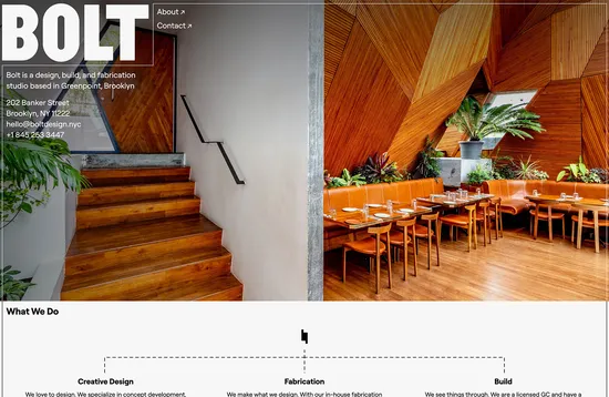
This is a great example of a simple, minimal design. Lots of space, well placed high quality images, and clean type. The copy is the real highlight here: well written and engaging, it presents a positive profile without losing itself in jargon.
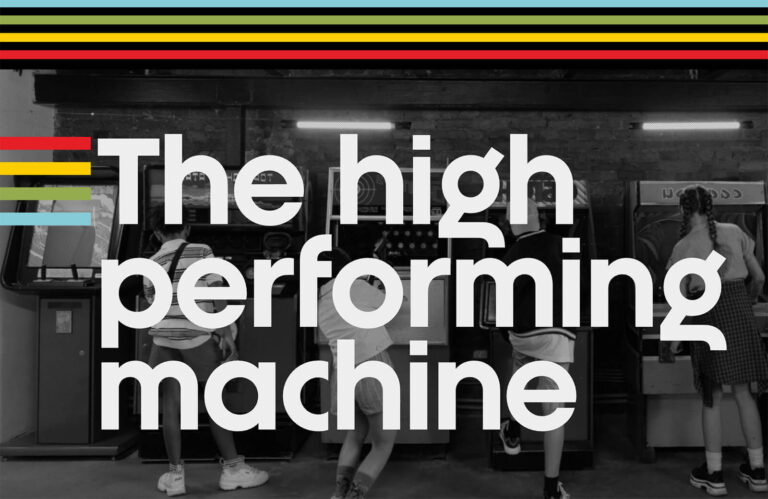
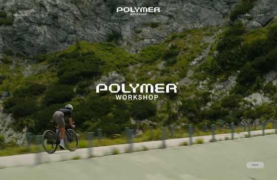
Polymer Workshop’s site aesthetic leans into the high-performance high-tech aspect of the brand’s products. The greyscale color scheme and text animations are reminiscent of futuristic interfaces.
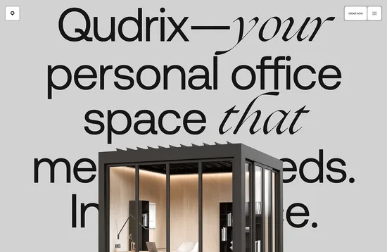
Qudrix is a freestanding garden office module. Using a single page for the majority of the site’s content helps maintain a nice narrative flow to the information presented, leading ultimately to the order and contact calls to action.
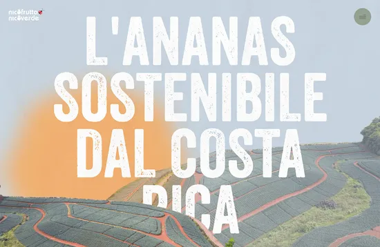
This site for pineapple importers Nicofrutta makes use of faded tones and a distressed display type to evoke the effect of the Caribbean sun.
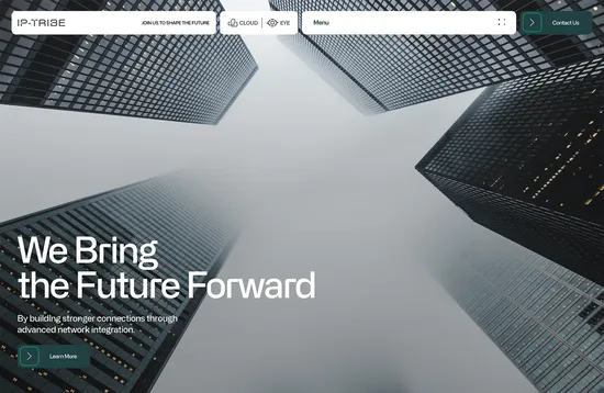
IP-Tribe’s website really embraces some recent big trends. A Bento style layout is successfully combined with background gradients straight out of the Y2K aesthetic. There is a lot going on, but it doesn’t feel busy or cluttered.
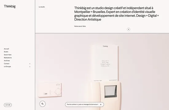
ThinkBig is another simple, but pleasing design. The background colors are gentle and the outlined grid both provides structure to the content and adds elegance.
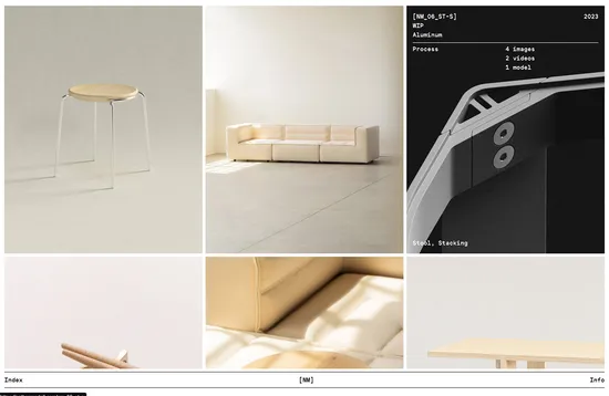
This is an appropriately minimalist site for a minimalist furniture designer. Close-ups of product details along with photographs and videos of the construction process emphasize quality.
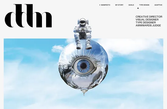
As an Awwwards judge, it would be fair to expect Danilo De Marco’s site to be a cut above, and this doesn’t disappoint. Although different types of work are presented in different styles, it all works well as a whole. The overall effect is of skill without unnecessary showiness.
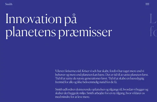
Smith Innovation is a sustainable construction consultancy. Where color is used it adds warmth, and content is presented clearly. The mobile version of this site is pleasing too.
